REG UK
Full rebranding for a tech startup aiming to disrupt.
(Client)
REG UK
(Year)
2019
(Services)
Branding, Print
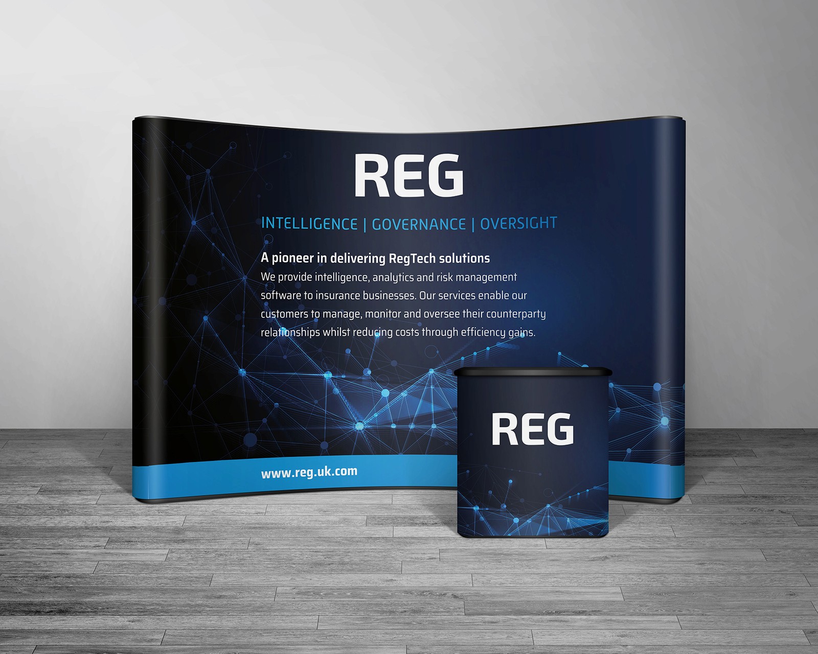
Knowing what to hold constant, and what to let flex.
The discipline here wasn't visual invention — REG's identity was already set. It was deciding which elements stay locked to build recognition, and which should flex to suit the context each piece lives in. Fixed across everything: the logotype lockup, the navy-and-cyan palette, and the cyan URL footer. Flexed by context: the hero imagery — the node graphic on large format for impact at distance, soft bokeh on the cards for a human, tactile feel up close — and the depth of copy, from a single value line on a banner to the full proposition on the exhibition wall. Consistency where it earns recognition; variation only where the viewing context genuinely demands it.


REG UK
Full rebranding for a tech startup aiming to disrupt.
(Client)
REG UK
(Year)
2019
(Services)
Branding, Print
Knowing what to hold constant, and what to let flex.
The discipline here wasn't visual invention — REG's identity was already set. It was deciding which elements stay locked to build recognition, and which should flex to suit the context each piece lives in. Fixed across everything: the logotype lockup, the navy-and-cyan palette, and the cyan URL footer. Flexed by context: the hero imagery — the node graphic on large format for impact at distance, soft bokeh on the cards for a human, tactile feel up close — and the depth of copy, from a single value line on a banner to the full proposition on the exhibition wall. Consistency where it earns recognition; variation only where the viewing context genuinely demands it.
REG UK
Full rebranding for a tech startup aiming to disrupt.
(Client)
REG UK
(Year)
2019
(Services)
Branding, Print
Knowing what to hold constant, and what to let flex.
The discipline here wasn't visual invention — REG's identity was already set. It was deciding which elements stay locked to build recognition, and which should flex to suit the context each piece lives in. Fixed across everything: the logotype lockup, the navy-and-cyan palette, and the cyan URL footer. Flexed by context: the hero imagery — the node graphic on large format for impact at distance, soft bokeh on the cards for a human, tactile feel up close — and the depth of copy, from a single value line on a banner to the full proposition on the exhibition wall. Consistency where it earns recognition; variation only where the viewing context genuinely demands it.